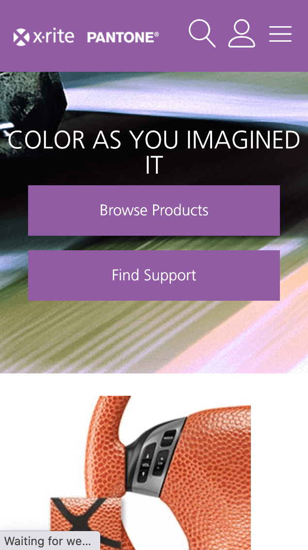
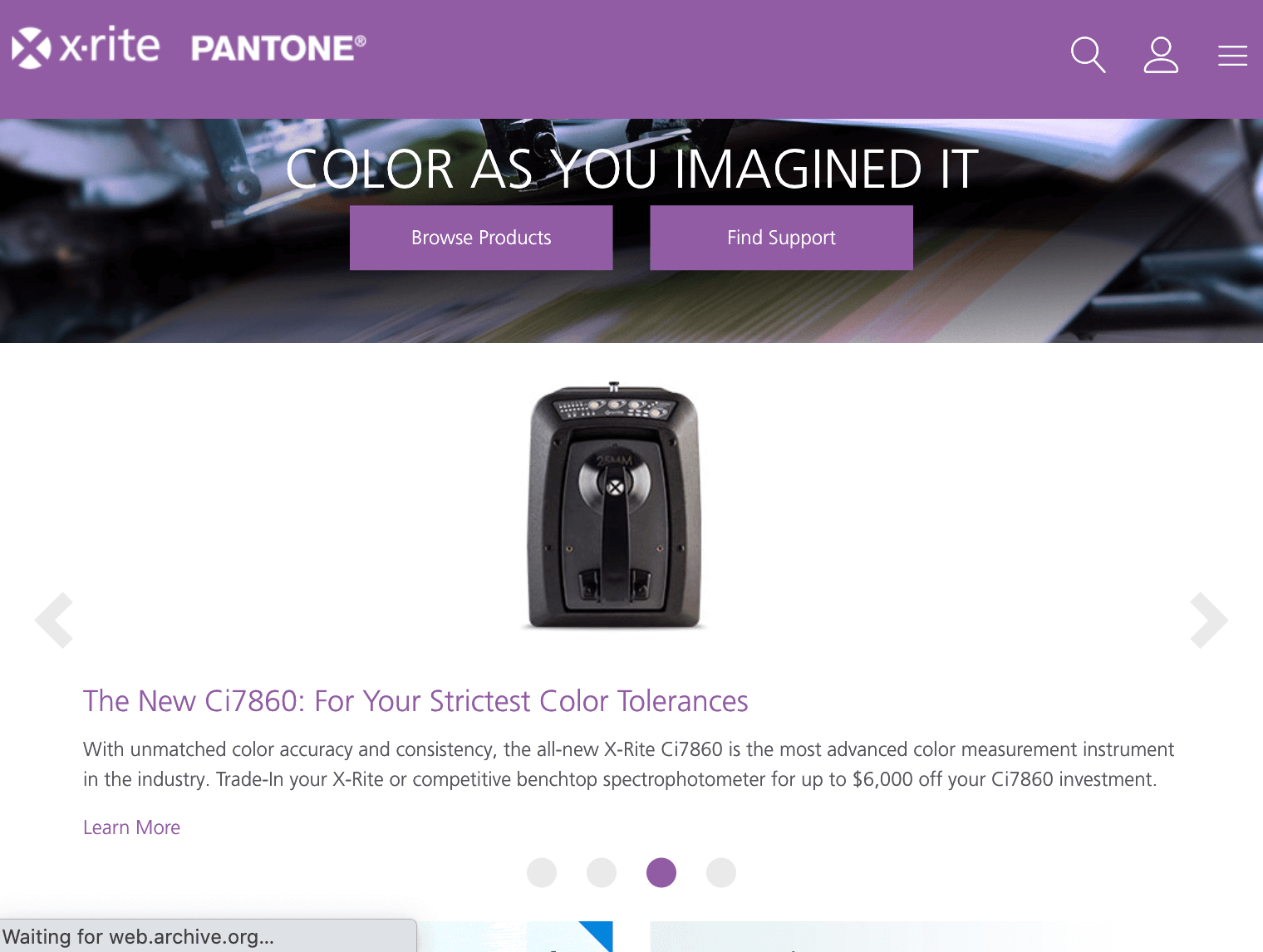
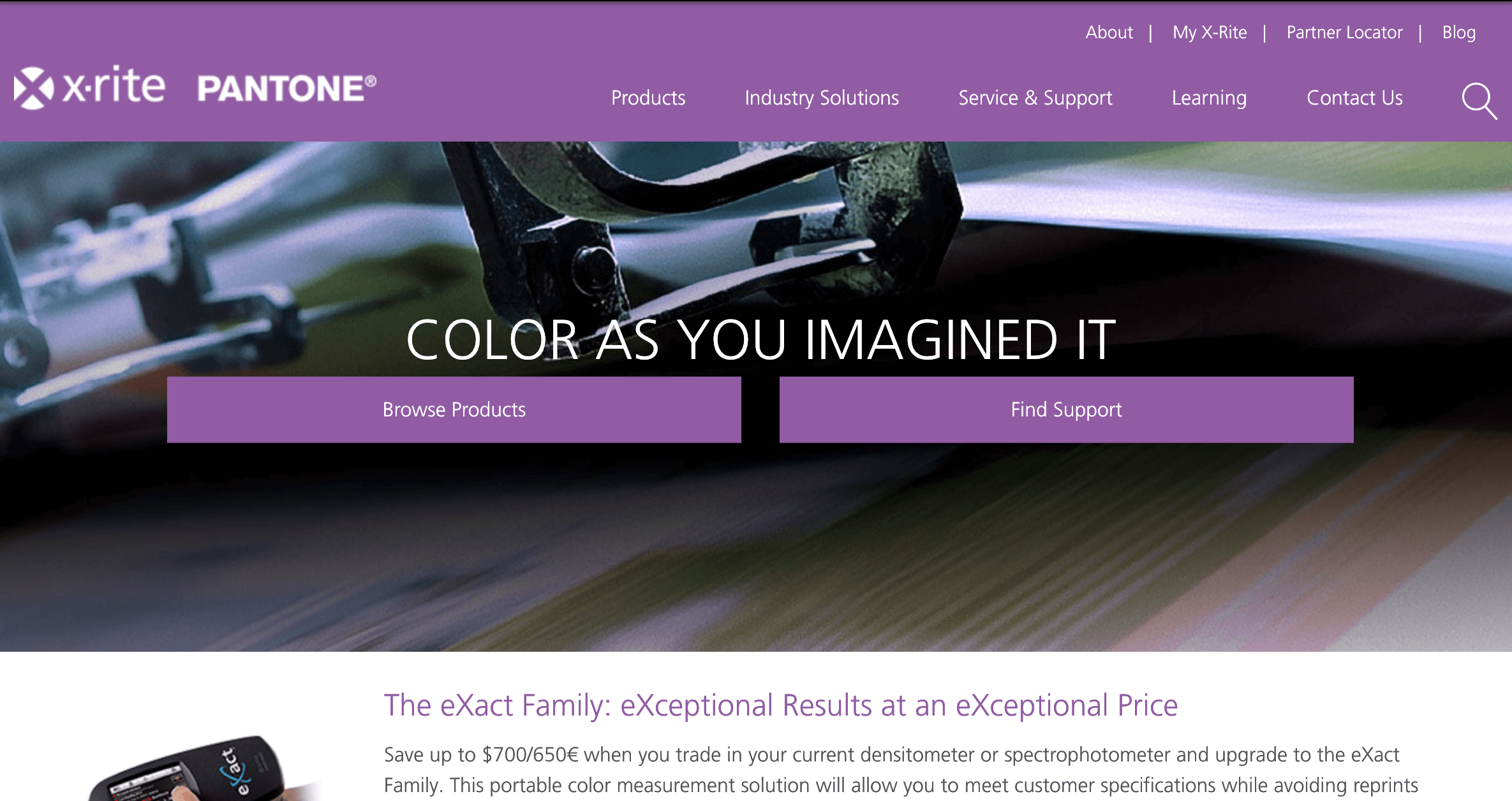
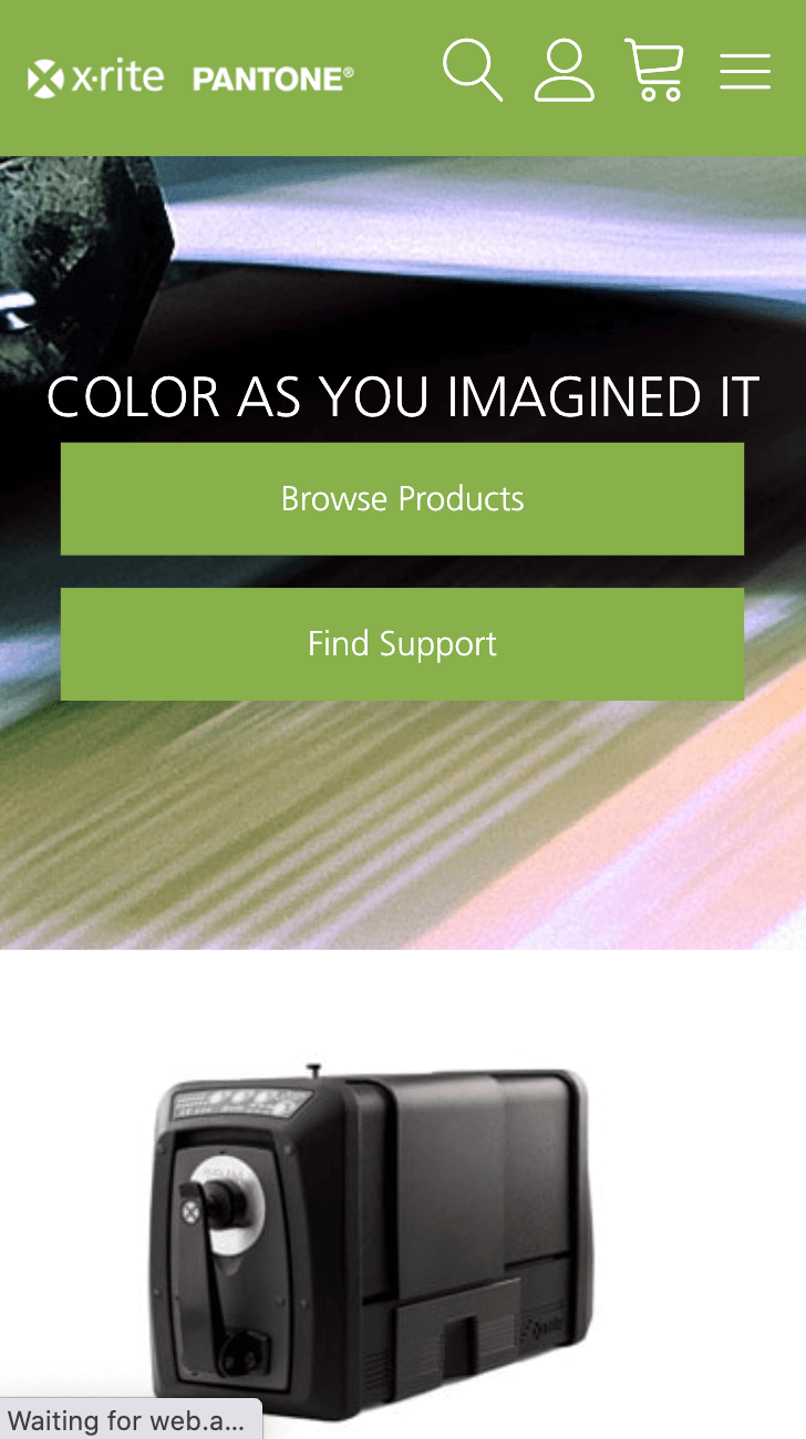
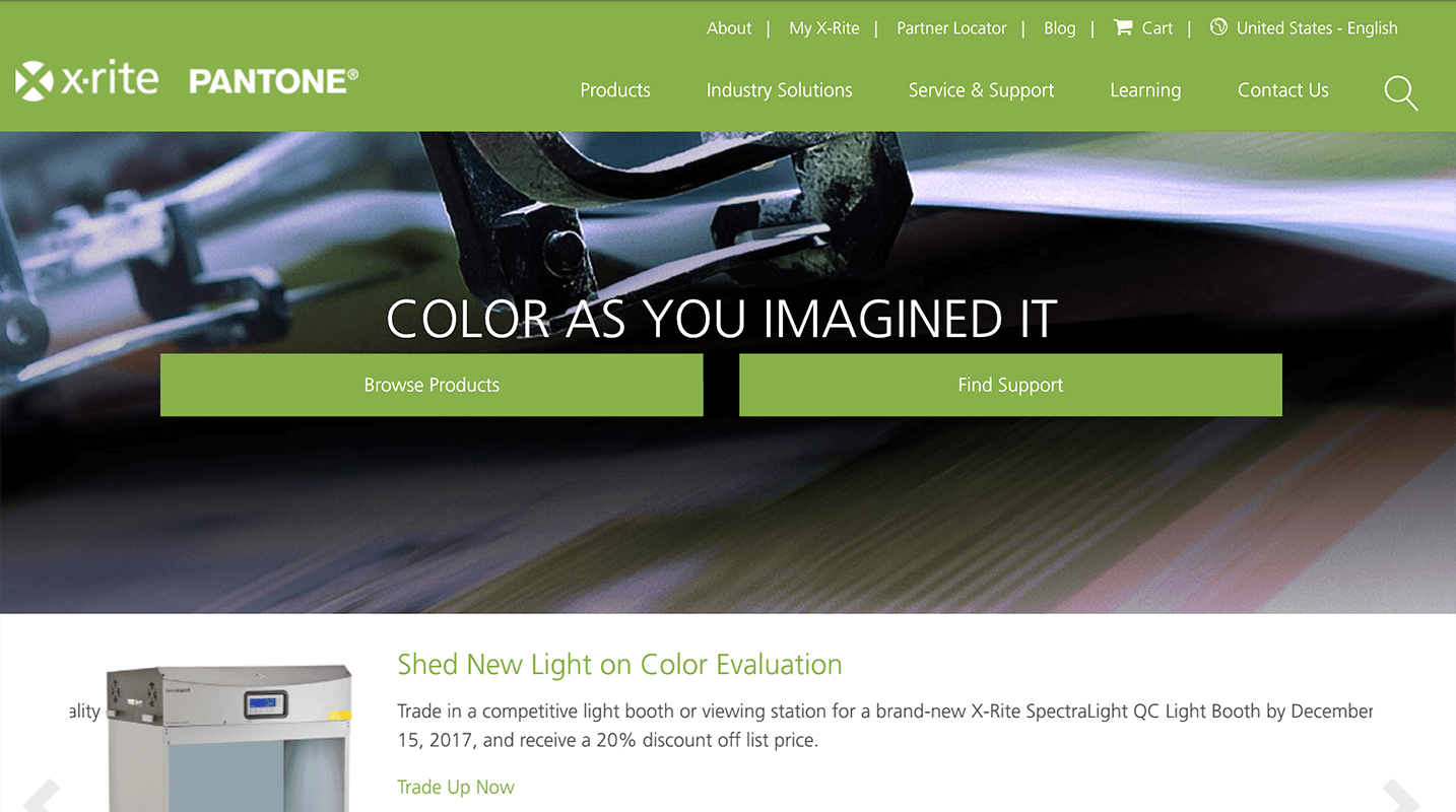
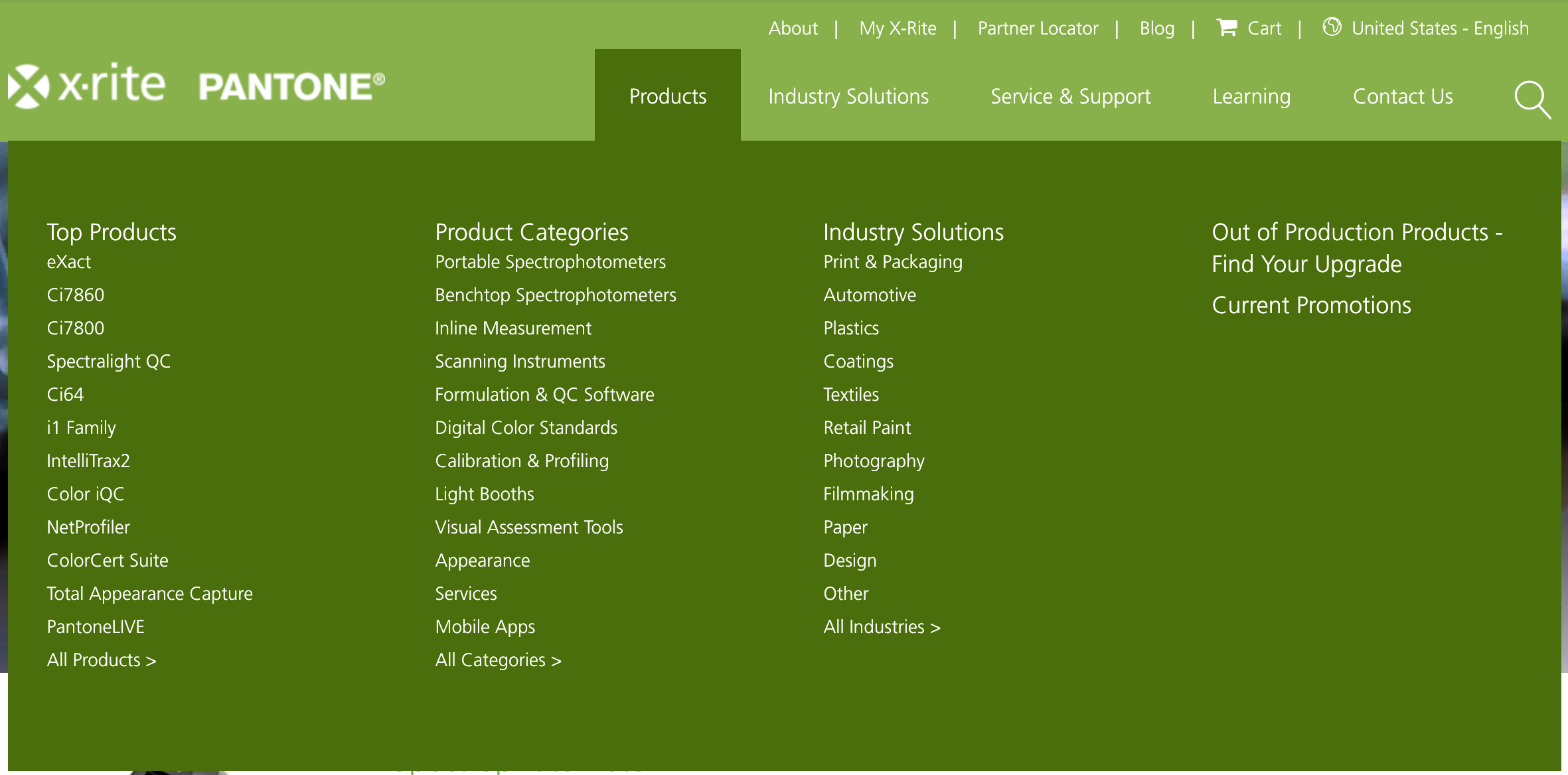
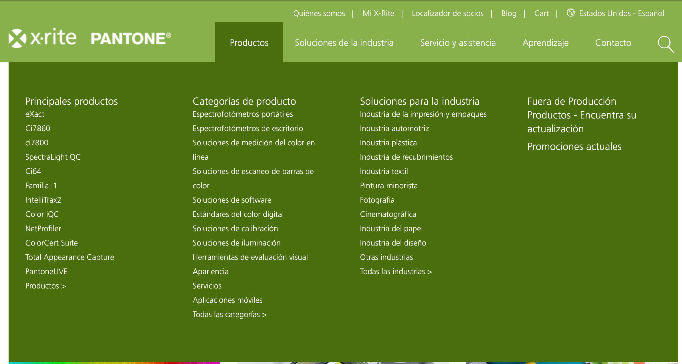
X-Rite was the first project where I had a major hand in the strategic direction of the design and technical implementation from pre-sale to post-launch. Not only did we establish a design system that was flexible to the international content needs of the premier supplier of color calibration technology in the world, I ensured that the system would be able to adapt to the needs of Pantone's color of the year marketing push.
Color Customization #
Pantone's color of the year is an extremely fun way for them to market their Color Matching System. A lot of effort goes into studying what might be the "Hot new color" of the year and all of Pantone's partner organizations love to align themselves behind that vision.
From the start, we knew that we wanted to create a system that was simple enough to deploy change in color scheme without having to reconfigure an entire code base. We created a system of SASS variables that could easily be updated within Sitecore so that they content author their changes rather than do a code deployment.

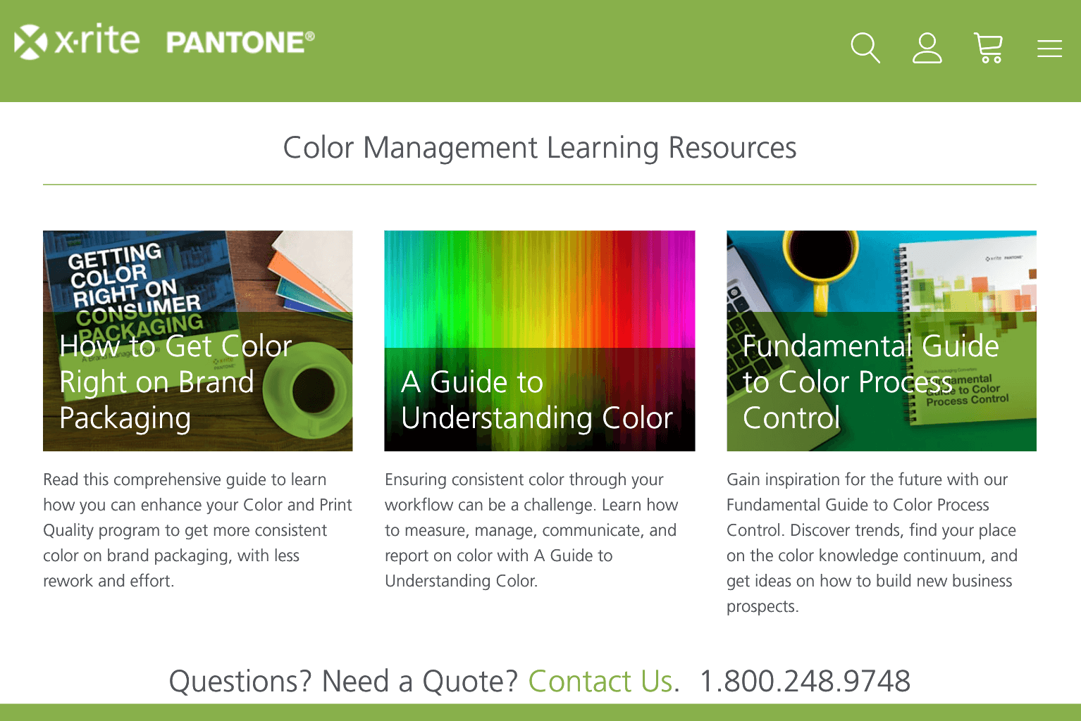
Internationalization #
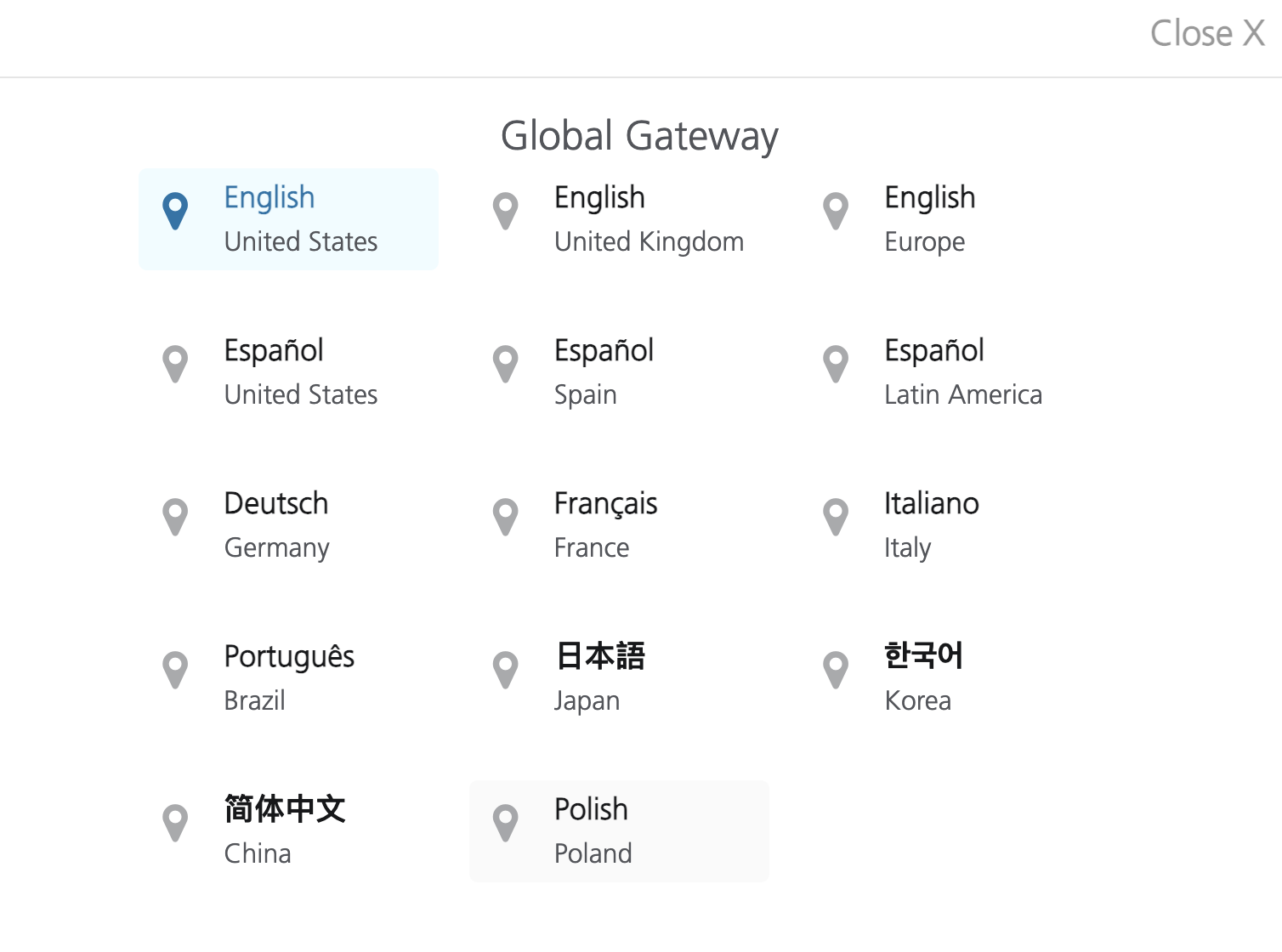
Managing personalized content within Sitecore is a breeze, which makes it the perfect solution to manage X-Rite's fourteen language Global Gateway.
X-Rite is a global leader of color calibrators. If you're say... Coca-cola... you want to ensure that every single bottle and can you produce is Coca-cola red. You've invested billions of dollars into your brand and you don't want that spoiled because the ambient temperature in a location causes one of the dyes to be a tad bit lighter.
You need 'Coca-cola Red',
not
'Cola-cola Almost Red'.
We leveraged Sitecore's internationalization engine to ensure that all of the Globally Unique Identifiers could be updated to both region and language appropriate copy. This provided some interesting design challenges. In German "About" transforms into "Informationen" which takes up some extra space in the header. Leveraging some flexible grid systems throughout the website we were able to ensure that every language could respond appropriately to our users screens.
Managing languages also required our own internal content strategy and workflows leveragine Sitecore as our content management system.
Building interactive experiences that drive traffic. #
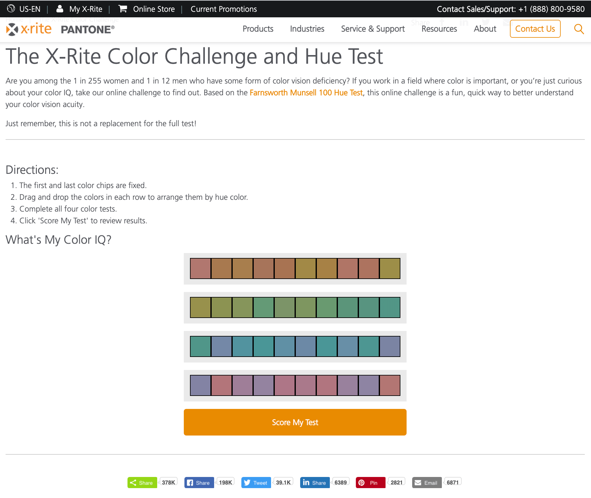
In order to drive traffic to the site, we built a responsive Color Challenge and Hue Test. One in 255 women and One in 12 men have some form of color vision deficiency. This interactive page served as an educational item that professionals who work with color could take to prove their mettle.
And they could send it to their bosses, friends, and colleagues. If those folks didn't do so hot, maybe your monitor isn't calibrated correctly and you can purchase a i1 Display Pro which is the perfect combination of unrivaled color precision, speed and controls for the highest level of on-screen color accuracy.
As of July 2021 this simple page has had over 378,000 shares.