It's the end of 2017, and The Big Game is coming to Minneapolis at the beginning of 2018. Hosted at U.S. Bank Stadium. With a Nielsen Rating of 43.1 and an average of 106 million viewers.
This meant a lot of high profile projects needed to be aligned to our new brand and exceed the Web Content Accessibility Guidelines.
New Homepage #
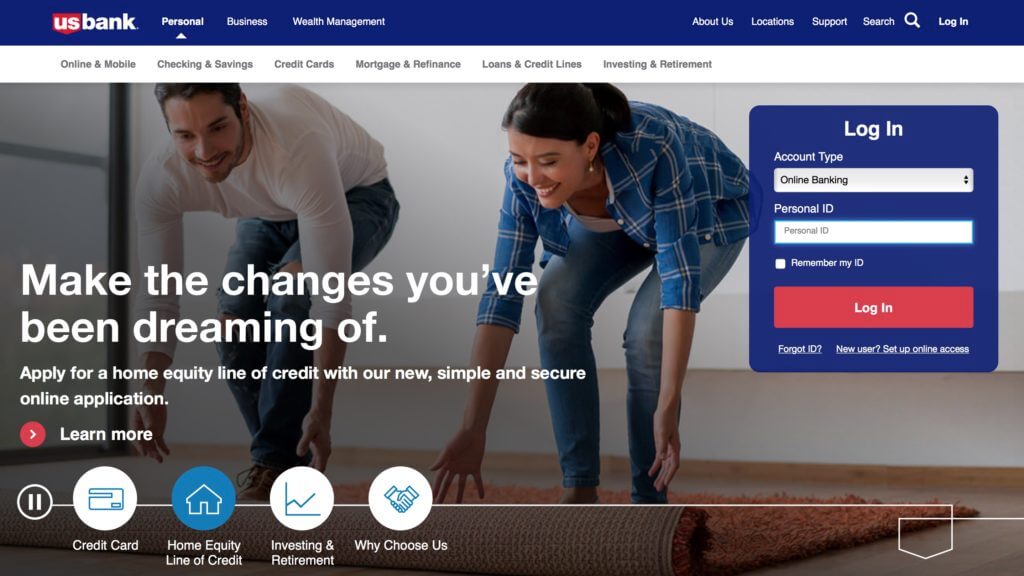
When you have that many viewers that might potentially hit your homepage and you want to get everything above the fold? Well, you build a carousel. Not just ANY carousel. A personalized carousel. A personalized carousel that was one of the most accessible carousels on the planet on such a high profile website. We ticked every box back in 2018. You could:
- Pause and play the auto rotation
- Delete Slides
- Navigate through with tabs, arrows, access keys, voice commands
And it was all built with vanilla HTML, CSS, and Javascript. With the amount of traffic that we were expecting, we needed to keep the webpage light and so that we personalize the content through our Adobe Target account and connect to other API's to continue to let folks log into their accounts.
You heard that right folks, hand-crafted, bespoke, web code, no fancy added libraries. Yo' momma didn't raise no fool.
We actually uncovered a bug with VoiceOver when you would lock a viewport to 100vh and with dynamic and personalized content and sent it over to some accessibility engineers over at Apple to document.

The quickest of wins for Online Banking #
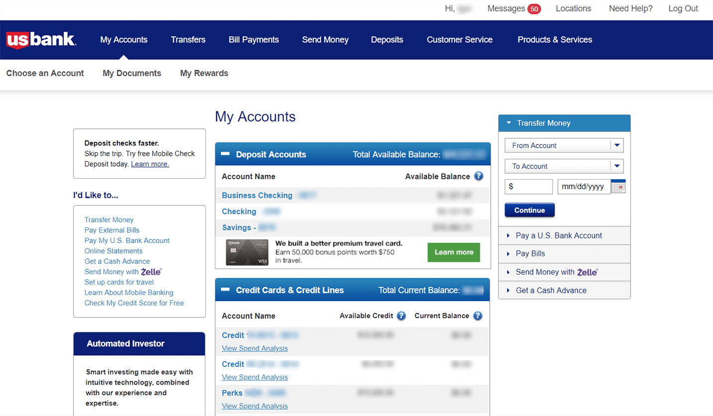
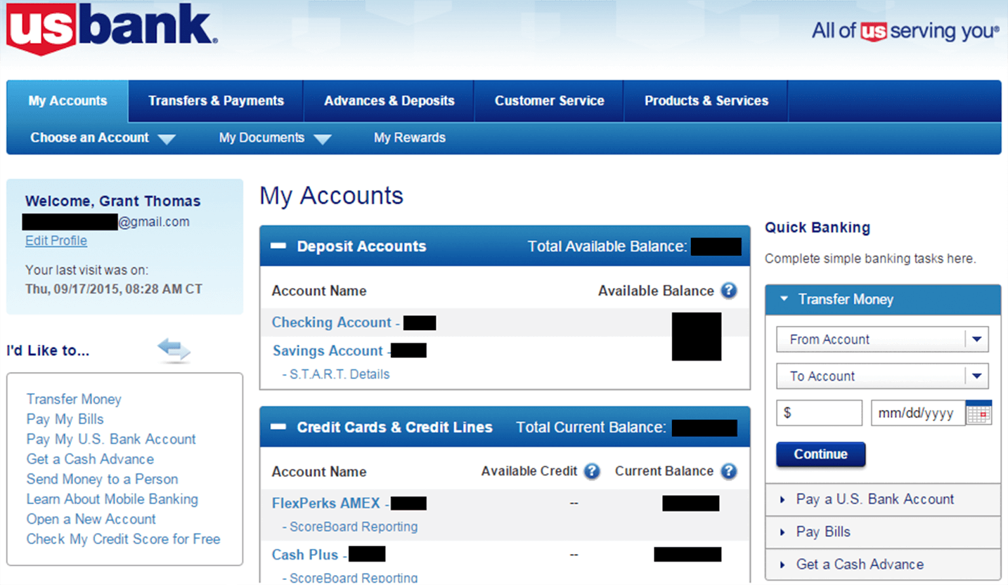
Our Online Banking portal was still using a slightly outdated brand. The trouble was that our technology partners had estimated that it would not be able to be done before our code-freeze date to make it in time for the Superbowl. I raised my hand, rolled up my sleeves and got to work.
I snagged the HTML, CSS and Javascript from online banking and created a local environment the replicated the development environment of our technology partners. This allowed me to work, and deploy changes without the overhead of the entire devops pipeline. Unfortunately I wasn't able to touch the HTML, but the CSS was fair game.
So anyway...I started blasting the CSS and rebuilt it from scratch (and throwing in some media queries and additional vanilla javascript to manage some tasty mobile hamburger navigations for bonus points), we were able to launch a slightly updated branding of our Online Banking portal just in time.

One Button, Two Button, Red Button, Blue Button #
After rebuilding little pieces of projects with vanilla HTML, CSS and Javascript I had a nice start to a hand coded design system. We had a significant amount of documentation within Invision but I was able to hand off reusable and WCAG 2.1 AA compliant code (I sat right next to some very gracious native screen reader users that I love dearly) to our technology partners.
There were a lot of designers, and a lot of disparate versions of elements that looked close but not exact. I worked with a lot of visual designers and user experience professionals to help them better understand the grain of the web, how inline, block, margin collapse, line height affecting the box model, and all that good stuff that caused major headaches.
The culmination of the HTML can be found in places across the public marketing site, consistently sized buttons are my mark. Unfortunately the design system I worked on was lost to time, but shortly there-after the Omnichannel User Experience team launched Shield, but if you ever see a CSS class that has an override and is prepended with "mr-" you know that's me!
